Designing a streamlined Apple Maps experience

The Brief
As part of a User Experience Design immersive course, we were assigned to Choose a Apple stock app. Conduct research that shows apple users frequently have hiccups when using one of the Apple apps and to provide new features to improve the app.
Approach:
The design for Apple maps was shaped by the principles of design thinking methodology - research, definition, ideation, prototyping, and testing.
Team Members:
Myself (UX Designer)
Tools:
Figma
Whimsical
Google Forms
My Responsibilities :
Project Management
Research
Sketching
Wireframing
Prototyping
User Testing
Persona creation
One on one semi structured user interviews
Timeline:
2 weeks

Apple Maps is a web mapping service developed by Apple Inc. It is a map system that helps provide directions and estimated times of arrival for driving, walking, cycling, and public transportation navigation.
1 .Research
I conducted interviews one on one and 2 sets of online surveys to get a concise and deeper understanding of the user problems when using apple map.
Key findings in the interviews and surveys :
26.8% of users directions not on time leaving me confused
26.8% of users of found apple maps to be not detailed enough
This was my 1st round of surveying to verify the most frequent problem among Apple users when using the Apple map .

Users Quotes
"It always gives me the longest route even with the quickest option"
"direction is too late leaving me confused"
2. Definition
Problem Statement:
How might we address the user's need for prompt direction and wasted time?
Add an quick alternate route while driving
Give directions with meters or km with distance helps user estimate there turn better
I conducted interviews one on one and then surveyed 20 users and summarized into this persona

User Persona :
Meet Olga !
Olga is 28 years old marketing manager and ios user for over 5 years that i interviewed
User journey - before using apple maps -while using apple maps- wasted time - negation not on time
Happy - gets in car to check the route - giving simple information for directions
In between not happy and angry - gives the longest route even when th quickest route is chosen while on the go for work - turning interactions too late leaving her unsure where to turn

This is the journey of Olga when she uses apple maps firstly she get checks the routes :
happy about simplicity of directions but on the way to work she is upset because she is given the longest route
turning time not given leaving her angry and confused on the road as this is a safety issue and on top she dose not reach her destination on time.
3.Ideation
I created a User flow to better understand the User and in my low Fidelity frames worked out ideas as well.

I created the user flow to understand the steps of the screen more thoroughly
4. Prototyping
These were the new features i worked on Focusing on users needs for find-ability, usability.

created this flow chart of Apple Maps Going through the steps of each screen from beginning to end. As well as adding my ideas for quicker route options and how to make better improvements for the app such as asking questions do users prefer for kilometers, meters ,millimeters,feet ? What do users prefer to use a pop-up option or not a pop-up option for a quick root?
High fidelity Wireframes:

5. Testing
I created online surveys to do usability testing
Online Survey to verify Usability Testing
We gained the flowing insight during 2nd phase of surveying :
80 % OF USERS PREFERRED IN METERS
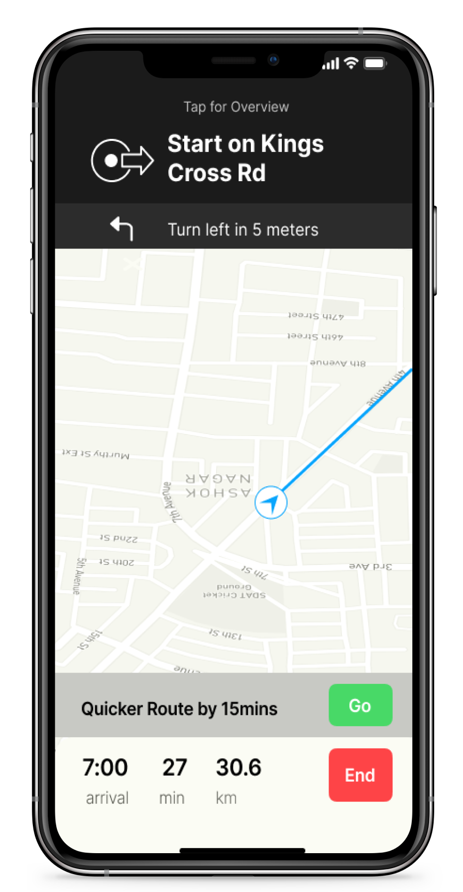
Feature 1
Users wanted detailed directions when making a turn in meters because it helps them estimate when to turn, as old features did not show in meters just days to turn.

50 % OF USERS PREFERRED A POP UP OPTION THAT HELPS GET TO THEIR DESTINATION QUICKER.
Feature 2
Users Wanted a quicker route option as the route are not helpful because it takes too long to get to a destination.

Key takeaways
This was my first project I learned about myself to pace myself and not to get overwhelmed with multiple options to choose to fix within an app. Throughout this project I had done 20 interviews and I had a hard time processing each interview because I had information overload. So I had to really look through my research again more thoroughly to determine the correct insight that makes sense. I finally understood a pattern when creating my affinity mapping that users with the same certain type of lifestyle tend to use the same app as compared to another user with a different lifestyle. Such as a college student vs working professional two different users.