Simplifying a floral e-commerce experience

The Brief
As part of a User Experience Design immersive course we did a group project where we could choose a problem space to explore and solution for. We choose a florist since it is consistently popular for events and flower delivery had experience an uptick in sales as a result of the
Approach:
The design for Floral Studio was shaped by the principles of design thinking methodology - research, definition, ideation, prototyping, and testing.
Team Members:
Myself (UX Designer)
Teresa Lu (UX Designer)
Daniel Varela (UX Designer)
Stephen Siu (UX Designer)
Tools:
Figma
Whimsical
Google Forms
My Responsibilities :
Competitive analysis, User research
One on one semi structured user interviews
Persona creation
Sketching
Wireframing
Prototyping
User Testing
Timeline:
3 weeks

W Floral
A Flower Shop that provides flowers for delivery and special Occasions.
A Floral Boutique that fulfills all floral needs for every occasions. They offer a wide range of daily flower & gifts, event decoration, wedding floral service, flower & balloon delivery and floral workshops.W Floral Studio is a new trendy floral boutique located in Richmond Hill, Ontario in Canada.
Research - Competitive Analysis
I conducted a competitive analysis to further understand how multiple businesses run a successful service for ordering flowers.
Competitive Analysis
What they did well:
Clear navigation and search
Clear delivery/ pick up guidelines
Accurate pictures to set custom
Simple checkout process tonic blooms versus W floral

Clear delivery/pick up guidelines tonic blooms versus W floral

Clear product page tonic blooms versus W floral

Tonic Blooms
A flower shop dedicated to simple affordable plants and flowers for any occasion Toronto Ontario demand flower delivery service that delivers across Toronto and southern Ontario.
Positives
Easy to use navigation and search
clear delivery pick up instructions
clear images of products
simple, attractive UI
Carries a selection of 3 to 5 seasonal flowers
bouquets made in under two hours perfect for last minute events offer same-day delivery
Negatives
Fine print: Two hour delivery Guarantee only Applies to Orders inside the specified delivery zone
Blooms
A high-end flower shop delivering plants and flowers
Positives
Clear navigation and search
clear images of products
simple check out process
Ability to receive delivery updates
attractive UI
variety of house plants and flowers
Customization available
Offers same day delivery
Negatives
Too many options can feel overwhelming
Flores Flowers and crafts
A flower shop running a family-owned business that specialize in personalized arrangements and customized packages for events.
Positives
simple navigation and search
clear delivery/pick up guidelines
clear images of products
simple check out process
Ability to mix-and-match flowers to personalize arrangements.
Negatives
No add on options at checkout (whats an example of an add on?)
no delivery updates available
limited visuals of flowers and plants
Define
We created an Affinity map to better understand users process and it helped us address user major concerns while shopping.

How might we simplify the floral ecommerce experience for W Floral
After analyzing our user interviews, 3 themes were uncovered.
- The navigation is confusing for users
- customers are unsure of what they're actually getting
-The delivery /check out process too is long and overly complex

We also uncovered that only 50% of our participants could not navigate through the website.
User Personas:

PLANNER/RESEARCHER
Plans for events ahead of time and will take the time to browse selection and quality. These customers typically are willing to walk in and check for flower quality.
Occasions:
Graduation
Congratulations
Funeral
LAST MINUTE SHOPPERS
Typically makes purchases for an occasion within 24ths. These consumers prioritize fast turnaround and same day shipping.
Occasions:
Valentines Day
Birthday
Anniversary
EVENT ORGANZIER / CORPORATE
Buy a larger amount of products and services but require more consultation. We will not be targeting this group.
Occasions:
Weddings
Company Launches
• I started out testing on paper first with my Ist sketches and did a play by play depending on the option chosen.
• User preferred a toggle button as seen on another website when ordering, user still found it to be a long process so with this in
mind, I started low fidelity on figma. with the new observations I obtained.
Wireframes
This is my first initial idea for starting off my low Fidelity Wireframes. I compared the checkout process of other shops such as clothing stores to flower shops to see if the checkout process can be modified to be more clearer.
These are my low to High Fidelity wireframes for W floral delivery to home option and pick up myself option.
Delivery to home

User testing and feedback
As a group we divided sections of W Floral and had these as the redesign for the homepage , product page ,menus and checkout page based on user testing feedback.
Homepage
Before and after

Search bar for a quick navigation
Clear CTA to improve conversion rate
Accessible Delivery navigation
Menu Feedback
Confusing to navigate
Inconsistent with us Desktop experience
Number of options Lead to decision paralysis

User testing showed none of these menus worked , too many options needed to be simplified.

New menu
Re-organized with familiar terms
Minimize the amount of options
Added the ability to shop all
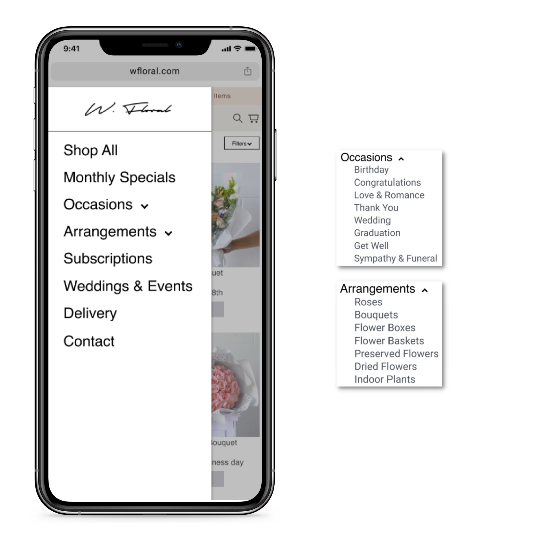
Old filter menu versus new filter menu

Product listings
Old product listings versus new product listings
As a Group we did an overview on the missing descriptions on the Old product page and discovered :
Missing business delivery information users didn’t know how quick can you receive the order
what the product looks like as there is images of flowers not clear to user what the exact product is, product description dose not match the images shown.
what type of color theme are the flowers
what is the type of cutting such ex seasonal roses
the type of arrangement for the flowers not shown
VS
New product page has clear descriptions for the following:
Business delivery information
items included in the bouquet with the type of flowers, plants, decoration items
Color theme of flowers
type of cutting such ex seasonal roses
type of arrangement for the flowers

Product page
Version one and version two
A/B Testing
We conducted a/b testing with two difference version to see which page is easier for user for usability and quick access to important information such as business delivery info, what products to look like and what there getting. As well as the organization for the product page had users confused so we re organized the flow from page to page that makes sense for users.

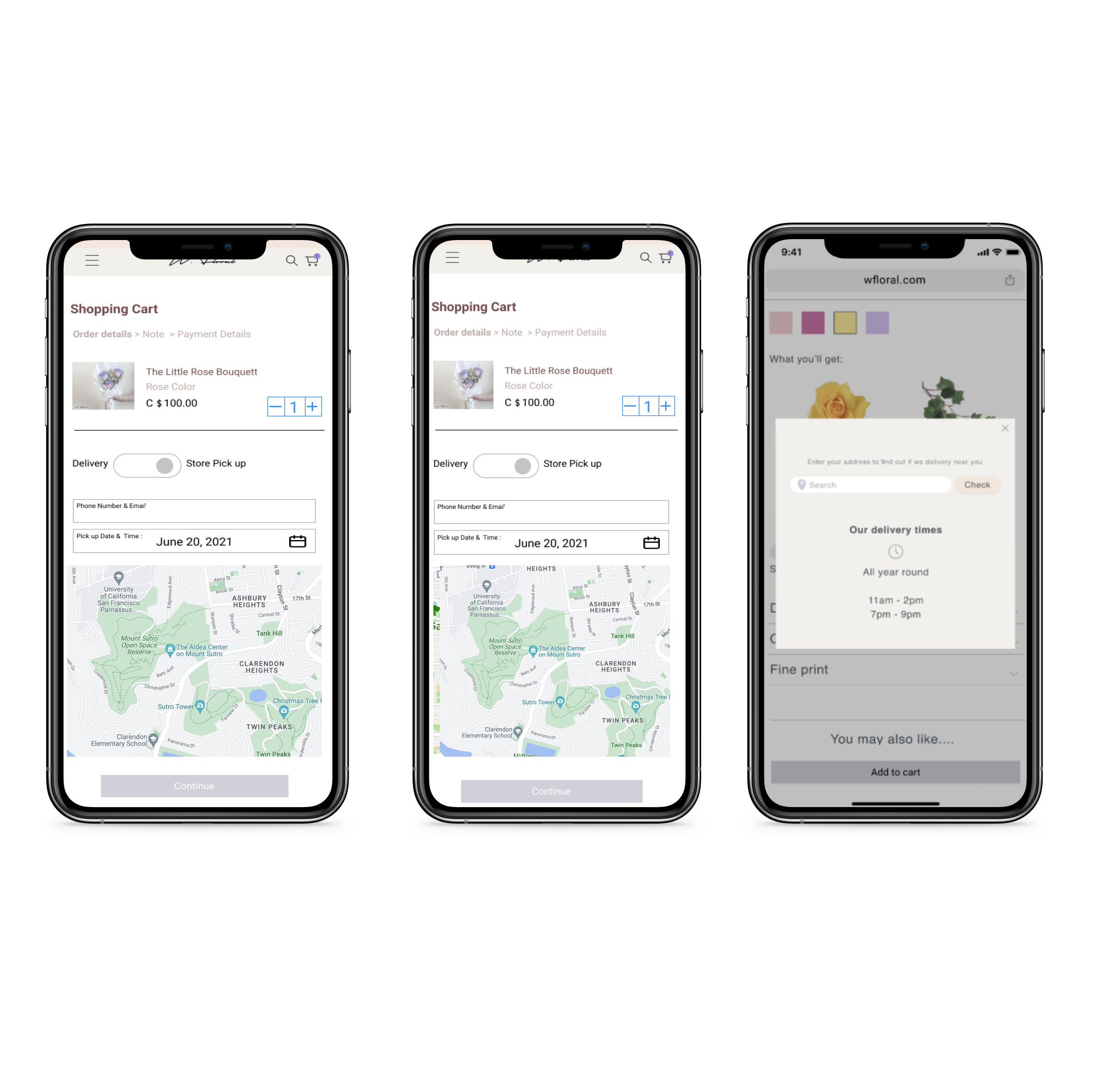
Delivery
Before & After
Three out of four preferred to click box on calendar to see available been to write in the day
Four users preferred to have time range rather than the exact time as as users are use to the shop usually giving them a time range when ordering
These are all the changes that occurred during a second round of usability testing.
Users didn’t like entering the date and time manually three out of four users preferred to click the day and time.
Three out of four users preferred to have a time range rather than exact time of delivery.
Before & After

Users found it easier to follow next steps as titles a top of page indicate next page
combine three pages into one page
users didn’t like jumping from screen to screen based on user testing
Before & After

These are all the changes that occurred during a second round of usability testing.
Users didn’t like entering the date and time manually three out of four users preferred to click the day and time.
Three out of four users preferred to have a time range rather than exact time of delivery.
Before & After

User testing showed users didn’t know what is available and time
pop-up window to show delivery times available in calendar system with time ranges
Check out
Before & After

50% of users had difficulty navigating through the store
user cannot edit easily 18 users were unsatisfied with re-adding items as they had to go back to item page to change date and time
Toggle button is it’s quicker process as before users had to move from a screening to screen

Conclusion
While conducting user research, comp analysis and creating solutions, I learned that I also have to be a clear communicator of ideas and be open to new directions when things do not go as planned. This was my 1st time working in a group remotely and it really pushed me to be mindful of time management while working independently.